The Qube, Art Auction Web Responsive Site Case Study
Project Overview
Based on the existing Moblie App, I designed itsresponsive website versions. The users are able to register, bid on auctions, view their bids, follow artworks and artists or receiving some changes status alerts.
The challenge
After selling artworks, hosting exhibits and organizing local auctions in its venue, the Qube Gallery wants to expand to the online market to promote local emerging artist and open a more global market
The goal
- Reach people outside of their current local influence area.
- Introduce and popularize new emerging artists.
- Generate more participation and engagement.
Target audience
35 to 80 years old art lovers with medium and high purchasing power. People interested in art both non proffesionals and proffesionals such as gallerists, art advisors, curators, collectors, . . . that are looking for artworks from new emerging artists to buy for investment or pleasure.
My role
UX / UI Generalist Designer.
Responsabilities:
- User Research
- Wireframing
- Prototyping
- Tester
- Data analysis
User research
I conducted a foundation research with the objective of finding what were the user’s needs and how to address those need with the product. I also prepare an empathy map and create personas according to an specific group of the target audience. Although this methods provided insights based on my own assumptions is a good base to start the project and conduct later on the process a more exhaustive user research to validate or iterate my own assumptions.
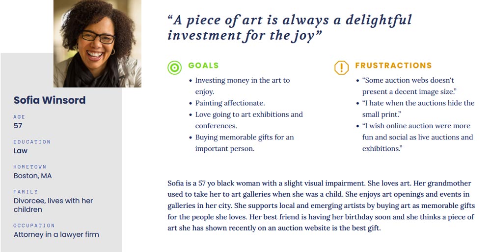
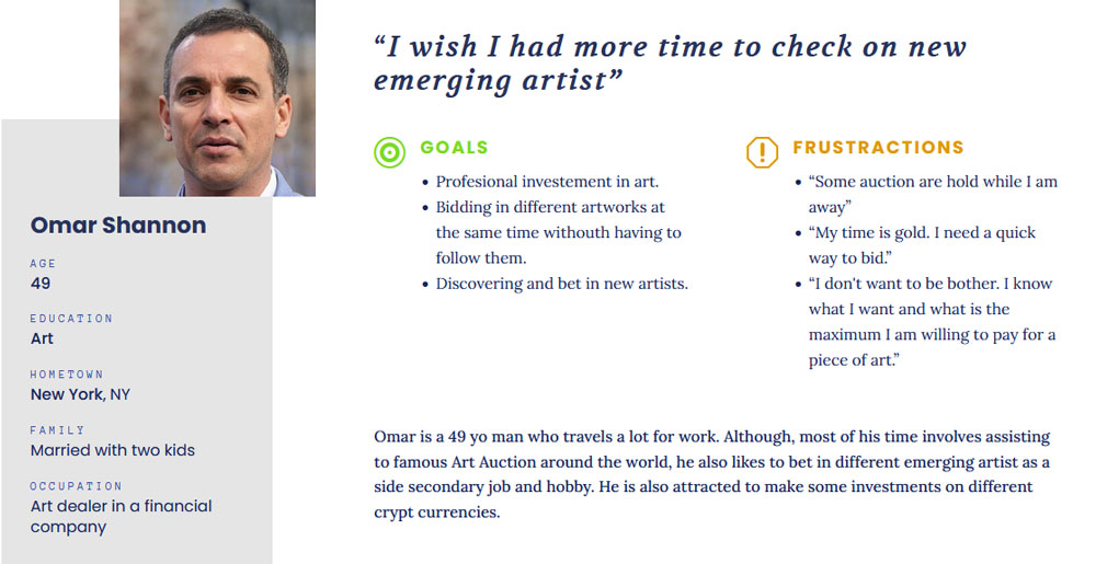
Personas
Pain points
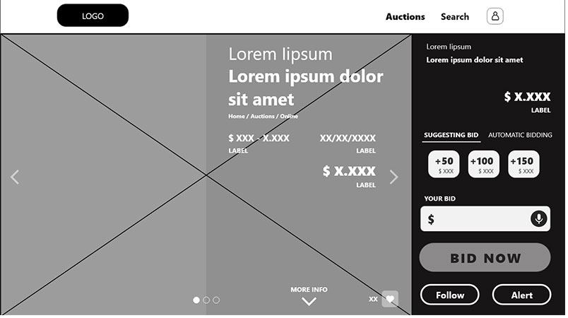
Hidden bid button
Some users complaint about not having on sight the bid button.
Surprising fees
Some users complaint about the additional charges that shows after bidding.
Small images
Some users wanted the possibility to zoom in the images and see them in detail.
Complex bid funnel
Some users find complicated the process of bidding in an artwork.
Starting the design
Paper wireframes
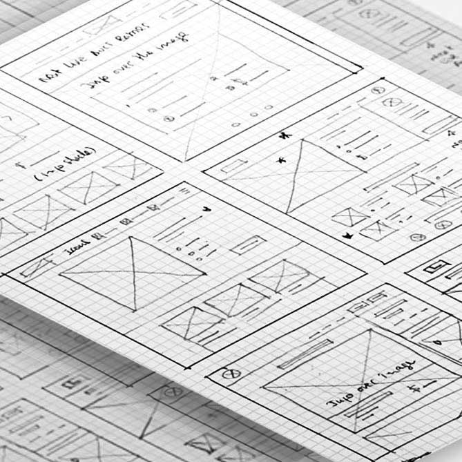
Translating ideas to paper in the form of wireframes is always a good way to get your hands dirty into the design work.
This quick way of sketching allow us to explore and improvise alternative design solutions.
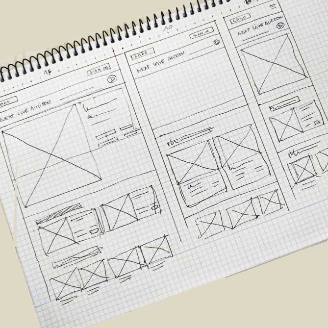
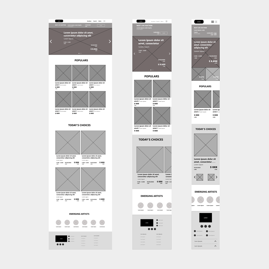
Paper wireframes screen size variations
Considering how the elements breath and move in differents screen sizes is fundamental for a good web design.
We should not forget that websites are made to be seen in different devices with different features.
Digital wireframes
In this part of the process, it was quite challenging having to deal with some realistic design visual challenges as sizes and shapes.
Digital wireframe screen size variations
A responsive website requires an extra effort to think in how to show the same content in different screens sizes without not producing an extreme vertical website. Use of different layouts and transforming grids to native draggable slides were a good solution for the smaller devices.
Usability test
I made a low-fi prototype with an user task to use in a usability test.
The task: From the home page the user had to find an artwork to place an automatic bid in it.
User flow: home / Search / Auctions: Search / Result page / Auction page / Auction sidebar: Automatic bid: text box: bid button
Usability study: findings
After conducting the usability test, I took the notes taking during the study and grouped them to find common themes in an affinity diagram.
The insights found in the study were prioritized and transformed into new designs challenges for me to solve.
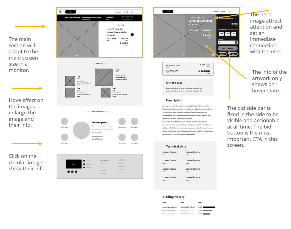
Hero image
Scrolling up
User were a bit frustrated after navigate the page to have to scroll all the way up to find the menu.
Additional cost
Users were a bit suspicious about to have to scroll down to find out there were additional cost.
Refining the design
I applied some changes based on the insights found out in the usability study.
Updates
Hero image

To facilitate the navigation and include a hint about the content of the page under the hero content, I added a link to the next section.
Benefits
- Avoiding confusion.
- Simplicity.


Updates
Scrolling up

To avoid scrolling up, I decided to keep the top menu visible at the top of the page .
Benefits
- Avoiding confusion.
- Simplicity.


Updates
Additional cost

I included a link to the additional cost in the fixed sidebar. Now always is visible in the main CTA.
Benefits
- Avoiding confusion.
- Simplicity.


Takeaways
What I learned
I learned about UX in a practical way by participating in the four parts of a design process through the creation of a digital product: empathise, define, ideate, prototype and test.
Impact
Some users I tested the prototype with were surprised at how intuitive it was.
Thank you for
your attention!
“If you think good design is expensive, you should look at the cost of bad design.”
Ralf Speth
CEO Jaguar Land Rover