The Qube, Art Auction App Case Study
Project overview
Auction App for an Art Gallery
An application that works for onsite and online auctions. The user must be able to bid on an item, view the status of the bids and in some cases, have the possibility of paying the items through the app.
The challenge
The Qube is an art gallery that has been holding exhibitions and selling works of art for more than 15 years, both directly and through auctions in its own facilities.
Due to the pandemic, these onsite auctions have been canceled and they have lost quite a few sales. They want to open up to new sales channels such as internet but without losing the essence of an onsite auction.
The goal
- Increase the number of possible participant and buyers.
- Reach people with disabilities that cannot assist to an onsite auction.
- Create an online auction app that generates the same expectation and excitement as onsite auctions.
Target audience
35 to 80 years old art lovers with medium and high purchasing power. People interested in art both non proffesionals and proffesionals such as gallerists, art advisors, curators, collectors, . . . that are looking for artworks from new emerging artists to buy for investment or pleasure.
My role
UX / UI Generalist Designer.
Responsabilities:
- User Research
- Wireframing
- Prototyping
- Tester
- Data analysis
User research
After collecting data on the target audience of an art auction, I created different user profiles to carry out an empathy exercise based on questions about their experience with both online and onsite art auctions, their advantages and disadvantages, their emotions and motivations to bet on one or another work, … Some pain points could been seen in the next page.
Although this exercise provided me with “subjective” insights based on empathy it can be to find basic paint points to start with and also to produce a more elaborate questions for future interviews or surveys with real users in a thoughtful foundation research.
Personas
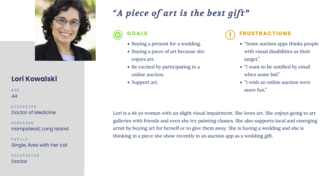
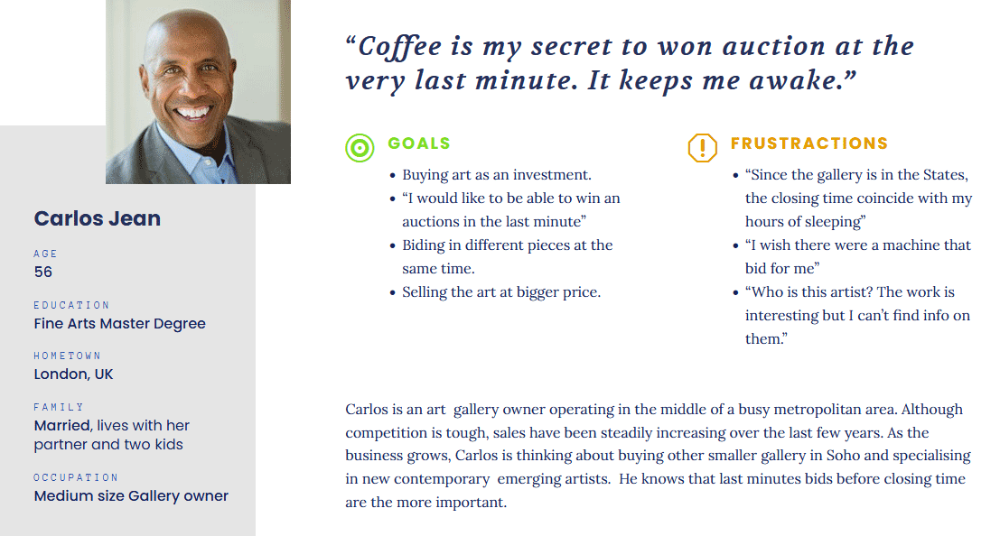
Pain points
Not equity and accesibile design
Some users with disabilities can’t attend to an online auction because their apps are not made for them.
Anoying or lack of notifications
Some users complaint that they don’t have much control over notifications. Some are too intrusive and others apps doesn’t have this possibility.
Lack of information
Some users complaint about the lack of information about the estimated value in emerging artists.
Time difference
Some users complaint that the finishing time of the online auction happens when they are sleeping.
Starting the design
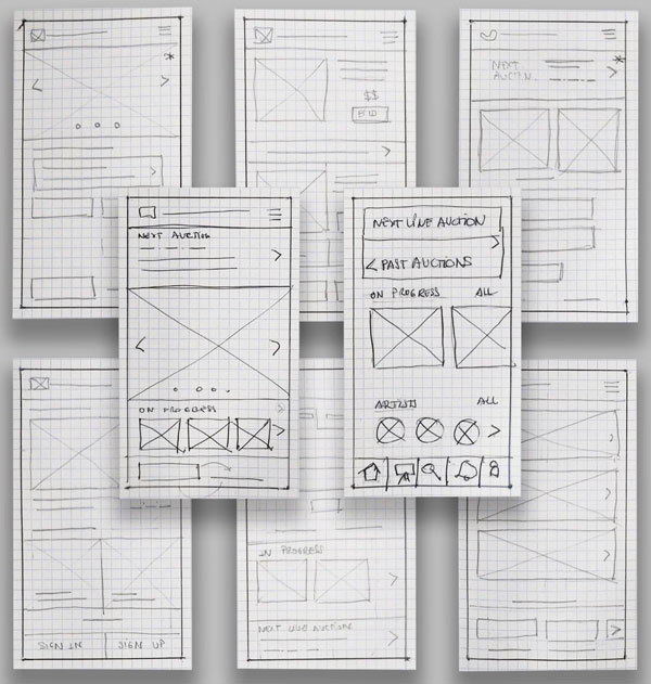
Paper wireframes
I started to do a lot of paper wireframes to define the structures of the main screens for the app.
I focused more in quantity and variety than quality.
They main challenge in this process was to keep in mind the required elements that I must included in the wireframes.
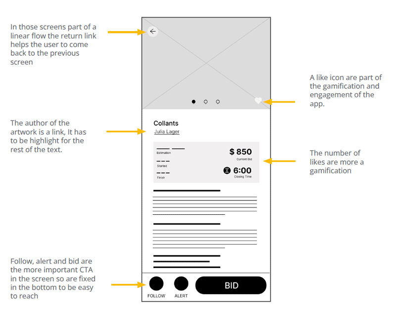
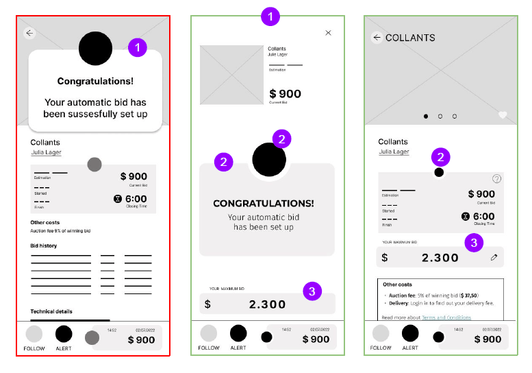
Digital wireframes
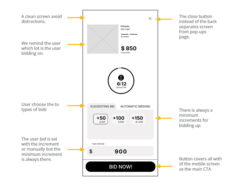
I turned the chosen paper wireframe into digital wireframes. A digital wireframe is closer to a mockup and although at this stage I didn’t have to deal with some visual aspects, I had to face some important content challenges.
The structure of the wireframes had to have some meaning. Especially in some screens that are part of a conversion funnel.
In those cases the screens had to be clean and simple.
The intentions behind my design choices were based on avoiding noise and confusion in order to facilitate the action that the user had to focussed on.
Usability test
I conducted a moderate online usability study with 5 participants. The usability study consisted of some questions, the tasks previously described and some follow-up questions related to the goals of my study.
Usability study: findings
After conducting the usability test, I took the notes taking during the study and grouped them to find common themes in an affinity diagram.
The insights found in the study were prioritized and transformed into new designs challenges for me to solve.
Terminology is not efficient enough to separate both concepts “Live Auction” and “Online Auction”
Insight
User tend to not make a distinction between online and live auctions.
Not all Top 10 are based in the same criteria
Insight
Insight
Refining the design
I applied some changes based on the insights found out in the usability study.
Updates
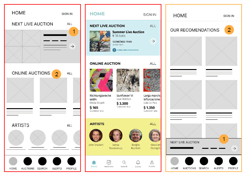
Changes on the layout of the Home page.

We reduced the size and moved and fixed Next Live Auction banner to the bottom of the screen.

Eliminate the section Online Auction and create Our Recommendation Section
Benefits
- Avoiding confusion.
- Simplicity.

Updates
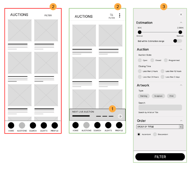
Correction of the Information Architecture.
Live Auctions and Artists contents were moved into the Auctions page as a subpages.
A new submenu containing access to Live Auctions and Artists was created.

The filter page was updated to make it more complete.
Benefits
- Access through a menu item.
- Now, all the artworks being or not a part of a live auction can be found in the same place.
- Now, the user can filter and order to reduce the results.

Updates
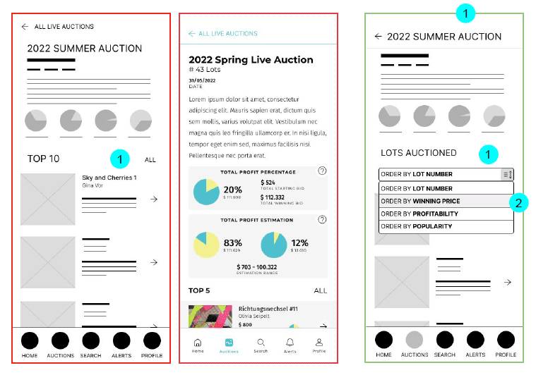
The Top 10 section was eliminated and instead of 10 items, every item are showed.
A new order by field was added.
The header was changed for the page title.
Benefits
- Avoiding confusion.
- Users can order the lots based on different variables.
- There is not an extra page to show all the artworks since the user can access to any of them from the same page.

Updates
Correction of the Information Architecture.
Live Auctions and Artists contents were moved into the Auctions page as a subpages.
A new submenu containing access to Live Auctions and Artists was created.
The filter page was updated to make it more complete.
Benefits
- Access through a menu item.
- Now, all the artworks being or not a part of a live auction can be found in the same place.
- Now, the user can filter and order to reduce the results.

Takeaways
What I learned
I learned about UX in a practical way by participating in the four parts of a design process through the creation of a digital product: empathise, define, ideate, prototype and test.
Impact
Some users I tested the prototype with were surprised at how intuitive it was.
Thank you for
your attention!
“If you think good design is expensive, you should look at the cost of bad design.”
Ralf Speth
CEO Jaguar Land Rover