WeCarryit, Courier App Case Study
Project Overview
WeCarryIt is an app and responsive website of a courier that try to facilitate the process of making a delivery to people who are new to technology.
The challenge
Mostly of the apps and websites were designed assuming the user has some experience using new technology. But due to the recently lockdown situation provoqued by a global pandemic a lot of user were obligated to quickly transitioning to perform some online tasks without any previous experience.
The goal
Consider and include the community of people new to technology as part of the target group for an app and the responsive website.
Target audience
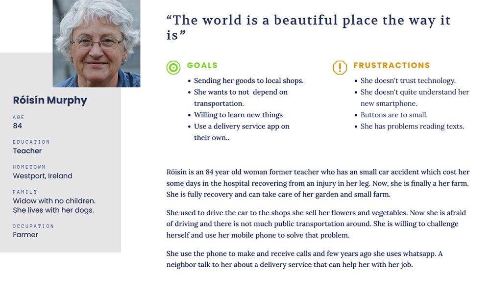
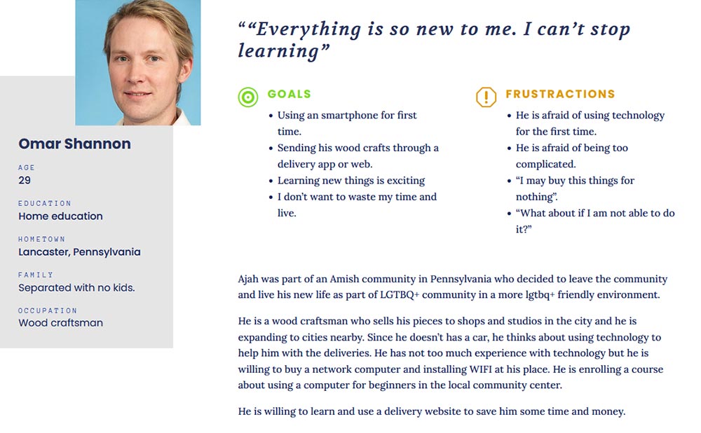
25 to 90 years old people with few or new to technology. People who for their own circunstances have live in an analogic world because of their convictions or their own circunstances.
My role
UX / UI Generalist Designer.
Responsabilities:
- User Research
- Wireframing
- Prototyping
- Tester
- Data analysis
User research
Since the goal of this project were create a delivery app for people new to technology the first thing I did was create different personas that fit the audience. Considering this personas, I carry out an empathy exercise based on questions about their few or lack of experience with courier companies, being either physical or online. Their emotions and motivations and pain points that this type of user has to go through when using an app for the first time.
Although this exercise provided me with “subjective” insights based on empathy it can be to find basic paint points to start with and also to produce a more elaborate questions for future interviews or surveys with real users in a thoughtful foundation research.
Personas
Pain points
Mobile phone gestures
Users new to technology perform only in basic interaction and doesn’t know phone gestures.
Old technology
Users new to technology are more familiar with old fashion designs and technology.
Old and small screen phones
Some users new to technology will probably have more outdate technology.
Help and Tips
Users new to technology need help that guide to perform some tasks.
Starting the design
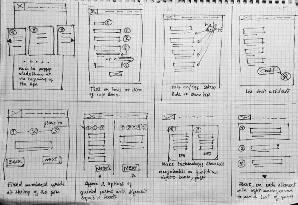
Paper wireframes
Digital wireframes
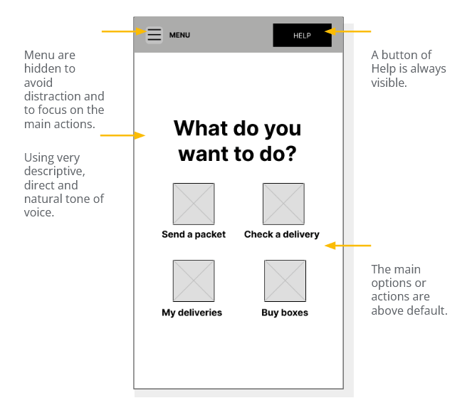
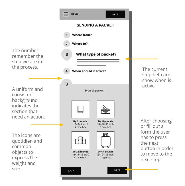
Separating the process in different steps help focus on the action needed at the moment and reduce cognitive load. Dividing the screen in two parts in every step help the user focus and recognize the actionable areas.
Usability test
I made a low-fi prototype with an user task to use in a usability test.
The task: From the home page the user had to send a packet.
User flow: home / Seanding a packet/ Packet details / Payment process
Usability study: findings
After conducting the usability test, I took the notes taking during the study and grouped them to find common themes in an affinity diagram.
The insights found in the study were prioritized and transformed into new designs challenges for me to solve.
Writing in a small device is complicated to people new to technology
Remembering Postal or Zip Codes
It was observed that 2 out of 5 participants have some problems remembering postal codes. This means that remembering addresses is easier to remember than postal codes.
Our experiences in the analog world determine our expectations in the digital world
It was observed that 1 out of 5 participants would find it useful to have a phone book to check recurrent names and addresses. This means that people new to technology tend to compare digital with analog worlds and look for similar solutions.
Refining the design
I applied some changes based on the insights found out in the usability study.
Updates

I added the possibility of voice recognition to avoid using the keypad.

I added the possibility of looking the contact in a phone book as expected in real life.
Benefits
- Avoiding writting.
- Offering the possibility to find the zip code through a geolocated map.


Updates
I added the possibility of voice recognition to avoid using the keypad.
I added the possibility of looking the contact in a phone book as expected in real life.
Benefits
- Avoiding writting.
- Simmilarity to analog world.


Takeaways
What I learned
I learned about UX in a practical way by participating in the four parts of a design process through the creation of a digital product: empathise, define, ideate, prototype and test.
Impact
Some users I tested the prototype with were surprised at how intuitive it was.
Thank you for
your attention!
“If you think good design is expensive, you should look at the cost of bad design.”
Ralf Speth
CEO Jaguar Land Rover